Monday, December 21, 2009
[N900 REVIEW] Part 2 : User Interface
Welcome to the part two of my Nokia N900 review. Today we'll take a look at the touchscreen and the up until now unfamiliar Maemo operating system.
As i mentionned on the hardware walk-trought, Maemo on the N900 is designed to run in landscape mode. With the exception of a small collection of applications (the phone interface for making calls, some 3rd party apps), so you’ll spend most of your time holding the phone in landscape. But, Nokia had promised a powerful desktop experience in the palm of your hand so you didn’t expect this to fit into a portrait screen did you? But hey, i want to use it as a "classic" phone too !
Maemo5 UI is slick, nice and finger friendly. Last thing also means that most of screen resolution is used for paddings, margins and frames. you'll love the flexibility and performance of the Linux (Debian) based Maemo operating system and, especially, the Hildon user interface, providing PDA (or even computer) like experience rather than dumb smartphone UI ! It is fairly fresh and unique (there are a few design elements that are similar to Android) and you'll enjoy its consistency and intuitiveness :
For example you can tap on the screen in any application to bring up a close box "x" in the upper right corner and a minimize and return to desktop function by tapping on the multiple window symbol at the upper left corner.
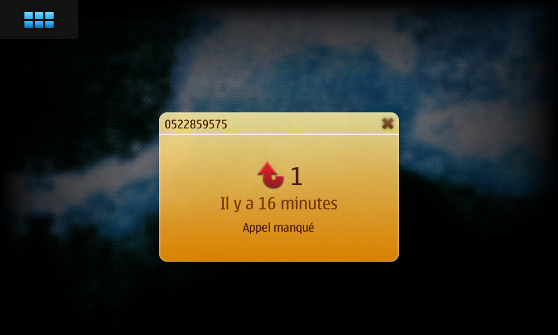
When a screen or dialog demands your response, background windows are blurred out of focus, so you're not confused by stacked windows and wondering which one you're supposed to tap on. You can get out of any window by tapping in the upper right hand corner of the blurred background.
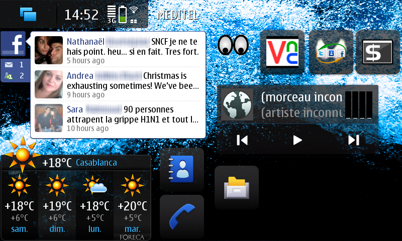
The N900 has 4 separate home screens / desktops (that you can freely disable or enable) between which you can quickly "scroll" just by swiping your finger from left to right or vice versa and i have to admit it's not very well thinked...i was hoping for the possibility to swip my finger from top to bottom or vice versa, it'll be more convenient in natural N900 position (landscap).
Each desktop can have a different wallpaper (or a set of wallpapers can be set for all screens at once) and totally different content (widgets, shortcuts, fav-contacts with availability status support, bookmarks etc).
You'll find the perfect set up having a home screen ready for web access with a few links to your favourite sites and a live web feed to a certain social networking site, a screen for multimedia with an MP3 player short cut, a screen for messaging with contacts and push email and finally a screen for navigation, or you can mix
them all in one as i did ;) But by far the best thing about multiple home screens is that no two N900’s will be the same, everyone will be able to create an experience that is just right for them !
The home screen configuration mode can be reached just by tapping any empty home screen area and then tapping the icon that appears next to the status bar, then you can freely move all enabled home screen contents all around the screen. You can even quickly move items between different home screens just by dragging an item to the left or right border of the screen which will automatically switch to the next home screen and move the item there !
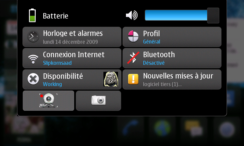
Also, as you may notice, there's a status bar on the top left corner (we can talk about this one in a two posts if you want ! But i'll only highlight what it can do in brief) that shows the time, battery life and network signal strength as well as any data connection you may have running. Clicking on this lets you change the time and set alarms, manage wireless connections, change profile, activate Bluetooth and change the volume. Opening this status bar acts as a sort of pop up :
Somtimes you'll be found lost if you're new to the new unconventional UI paradigm of the Maemo5, for example, to install the ring tone to Nokia N900 device, you have to :
1. Go to Settings
2. Select Profiles applet
3. You see page with Silent and General -buttons. It is pannable. Scroll (pan) it down. Ring tone button comes visible.
4. Press the Ring tone button to choose the ring tone.
5. Click Add on the right hand bottom side of the screen
6. Go up from Audio clips folder since it is most likely not in the audio clips folder with the button located to the left hand top side of the dialog.
7. Point your ring tone mp3 file (you need to point the file, you can't choose Artist/Album/whatever)
8. If you did it right, the new ring tone starts to play
9. Click save and you are done!
In symbian phones, this is done in 6 steps (we're talking the classic way to do it here) !
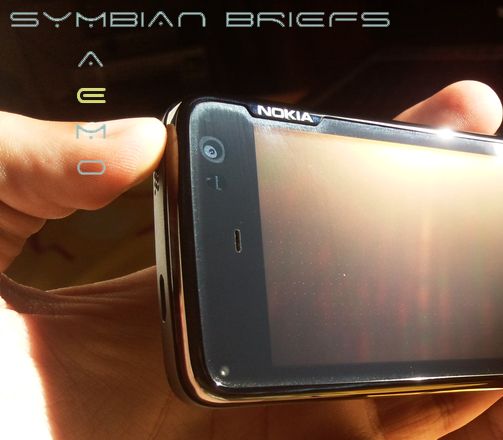
A final word on the screen, it is resistive, so it is not as responsive/sensitive as capacitive screens of e.g. the Omnia HD and requires pressing it a little bit harder. But not to a point that would make it an issue. the responsiveness of the N900 display is considerably better than of the 5800 XpressMusic and the N97 and i think Nokia has made it special somehow (Do you see the electronics sensors below? Like a capacitive screen ! yes, my 5800 for example doesn't have them ;))
To summarize : UI is overall very nice, maybe some work should be done to make it more useful in some departments but nothing to complain about, really, well done Nokia !.
What's hot :
- There's none of the S60 one-click-here-two-clicks-there inconsistency to be witnessed with the Linux-based platform.
- Clicking somewhere outside to get the main menu or going back a step
- Three levels organization of the UI rather than two. (The extra step added between the homescreen and the main menu is reserved for the task manager, so you'll always have your open applications at hand).
- 4 side-scrollable fully customizable screens/desktop
- Plainness of the homescreen management
- Best resistive screen on the ever had yet ! and one of the sharpest ones
- Task switcher as the Maemo OS cornerstone
- Kinetic scrolling
- Very rich status bar
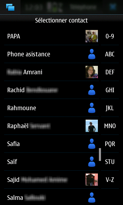
- a decent amount of eye-candy with the main screen getting out of focus when a dialog pops-up (Apps also disappear with nice effect when closed from the task bar and the automatic rotation in the phonebook is pretty nice)
- N900 always remembers in which home screen you were recently using and it will always show it, even after you reboot the device.
What's not :
- The lack (at the moment) of portrait mode in the whole interface (after all this is a phone too, isn't it?).
- Scrollable screens in horizontal only.
- I wished if there was a capacity screen instead (you know it matches very well with the kinetic scrolling).
- The lack of Multi-select feature in some applications (email, for example)





No Response to "[N900 REVIEW] Part 2 : User Interface"
Post a Comment