Hello folks, here i am with another device to review for you, it's advertised as an entertainment device by Nokia, and some people will try to compare this device with the Nokia N8, as I guess I did as an owner and user of an N8 already.
However, it’s not aimed at the same audience : The Nokia N8 is all about capturing and sharing the world in as much detail as possible with its 12 megapixel camera, the Nokia X7 is more about being able to enjoy content that’s already out there. Like enjoying games, music or videos, but how? Lets give it a read !
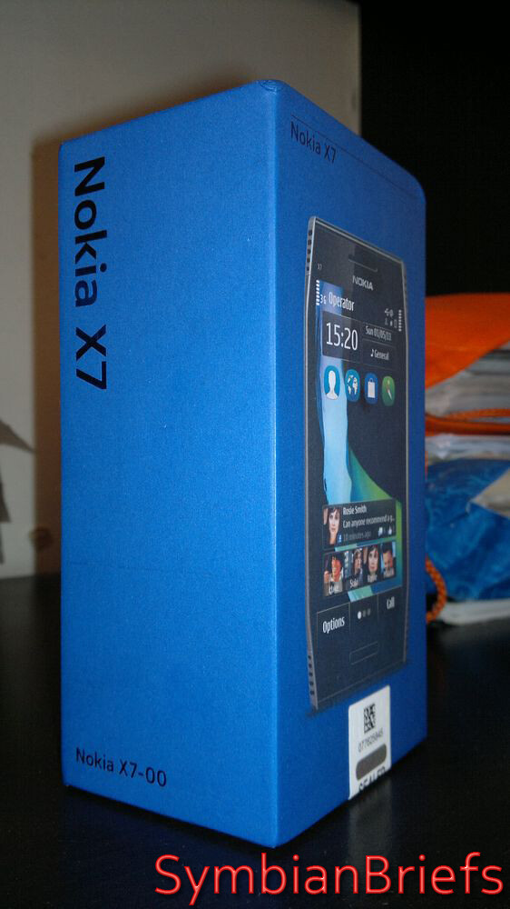
The box unlike the usual flip boxes, is a sliding sleeve that immediately reveals the device. It’s kinda Apple style as some might say, even Samsung (Omnia, Galaxy etc.) came in a similar layout (which of course, copied the minimalistic Apple packaging)
 |
- Nokia X7 handset
- Nokia Battery BL-5K, 1200 mAh(built-in)
- Nokia 8GB Memory Card
- Nokia Fast Micro USB Charger AC10
- Nokia Stereo Headset WH-701
- Nokia Connectivity Cable CA-179
|
Underneath the phone, the tray for the sim card is already removed, indicating to the user that this can come out of the phone and this is how to insert the SIM card. There’s also a clear sticker on the back of the X7 to explain this.
The box contents are hidden in smart layers. Peel off the mould for x7 and you have a separating layer, inside of which actually houses a little pamphlet manual.
The headphones and USB cable are neatly tucked away in a black labelled box, charger sits open nicely.
 |
| The little box contain a stereo headset, the usual USB cable, a charger and a quick manual |
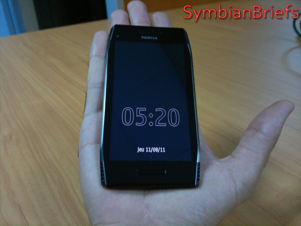
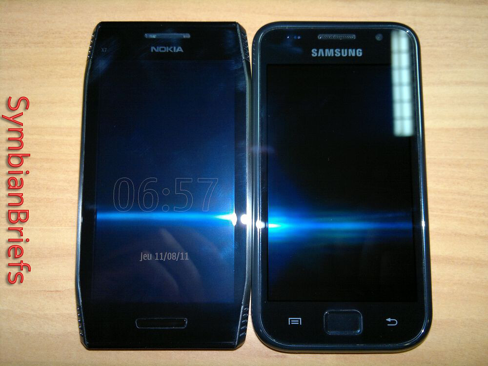
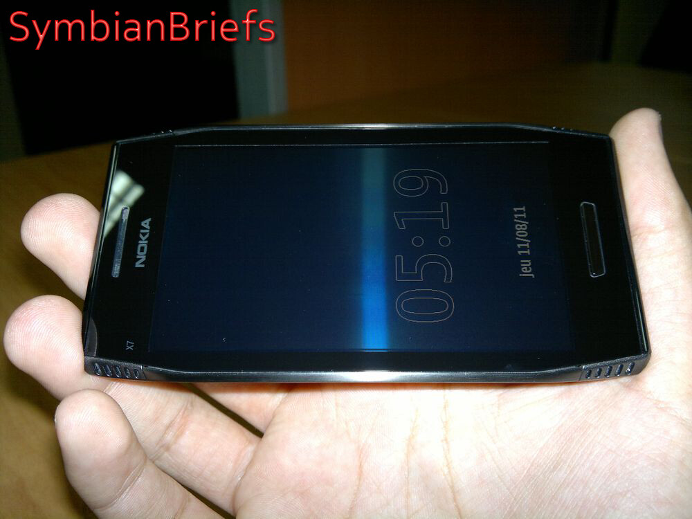
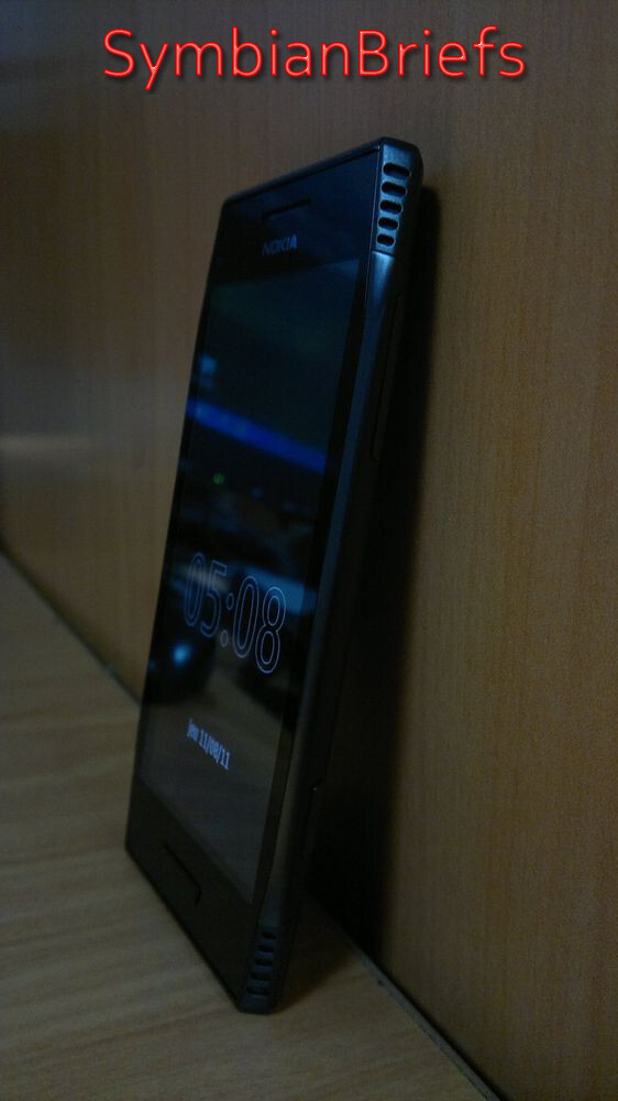
The first thing I noticed about the Nokia X7 is the design and size. It’s a larger phone than the N8 I’m used to, as it has a 4-inch touchscreen (made from toughened glass) and the corners of the phone are uniquely shaped, as they taper off to give an angular look. It’s something different to the usual rounded edges we’re used to seeing from Nokia and other smartphone vendors.
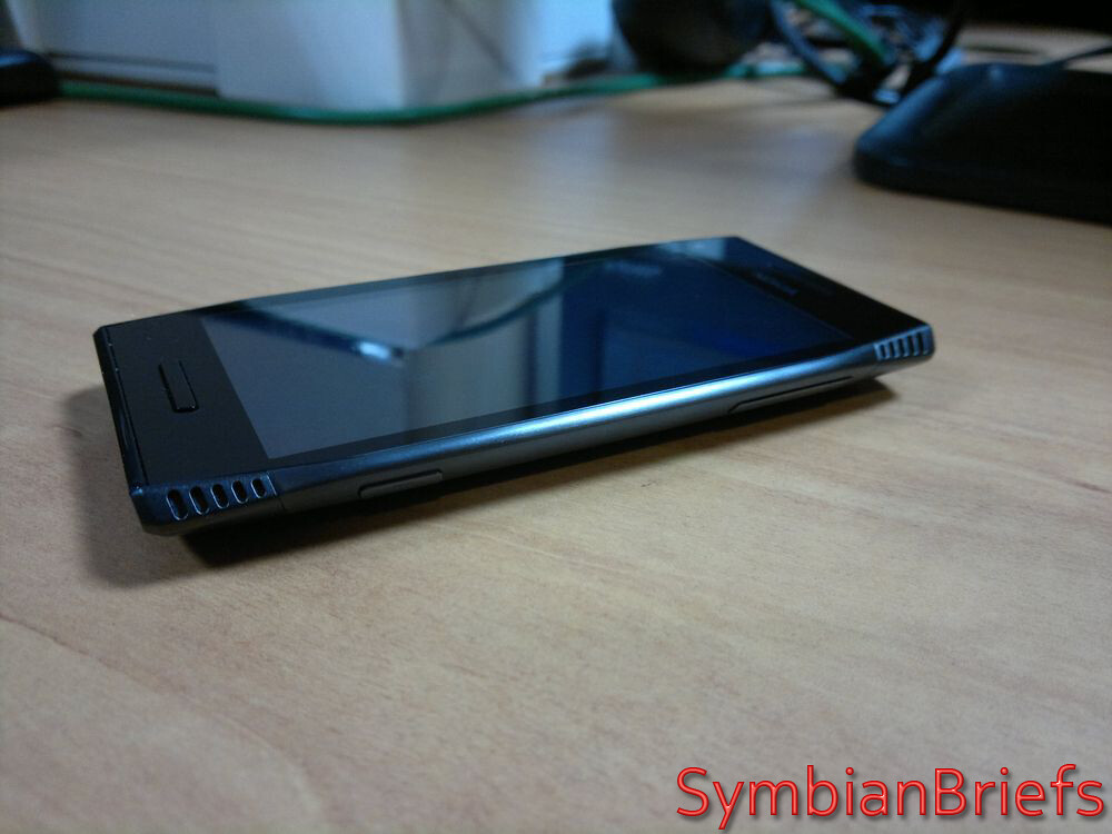 |
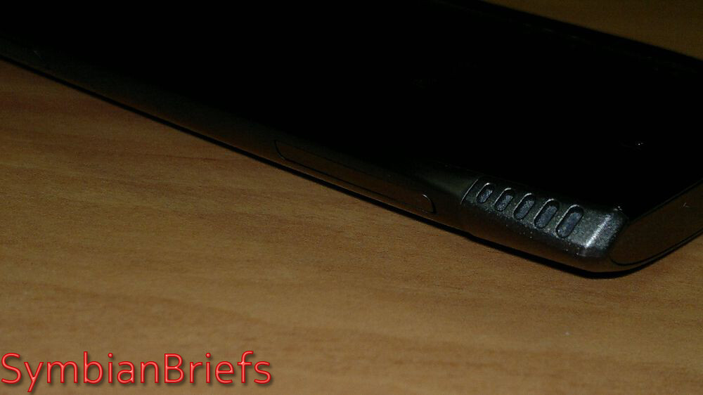
| The Nokia X7 is coming with a rather unique angular design with four grills on each of its corners |
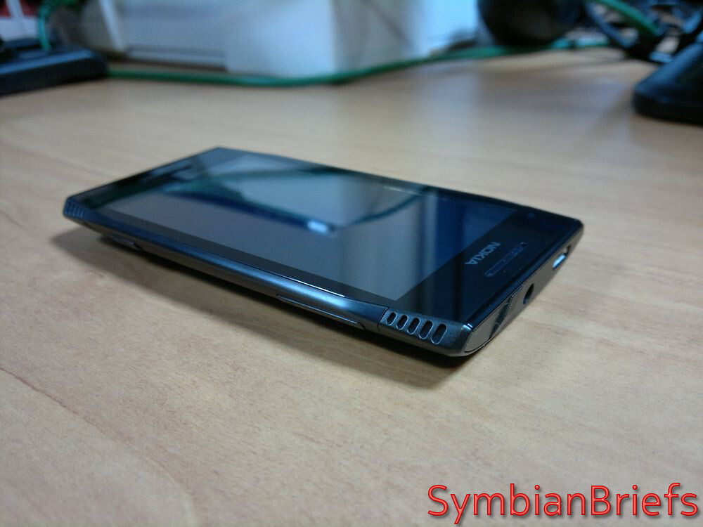
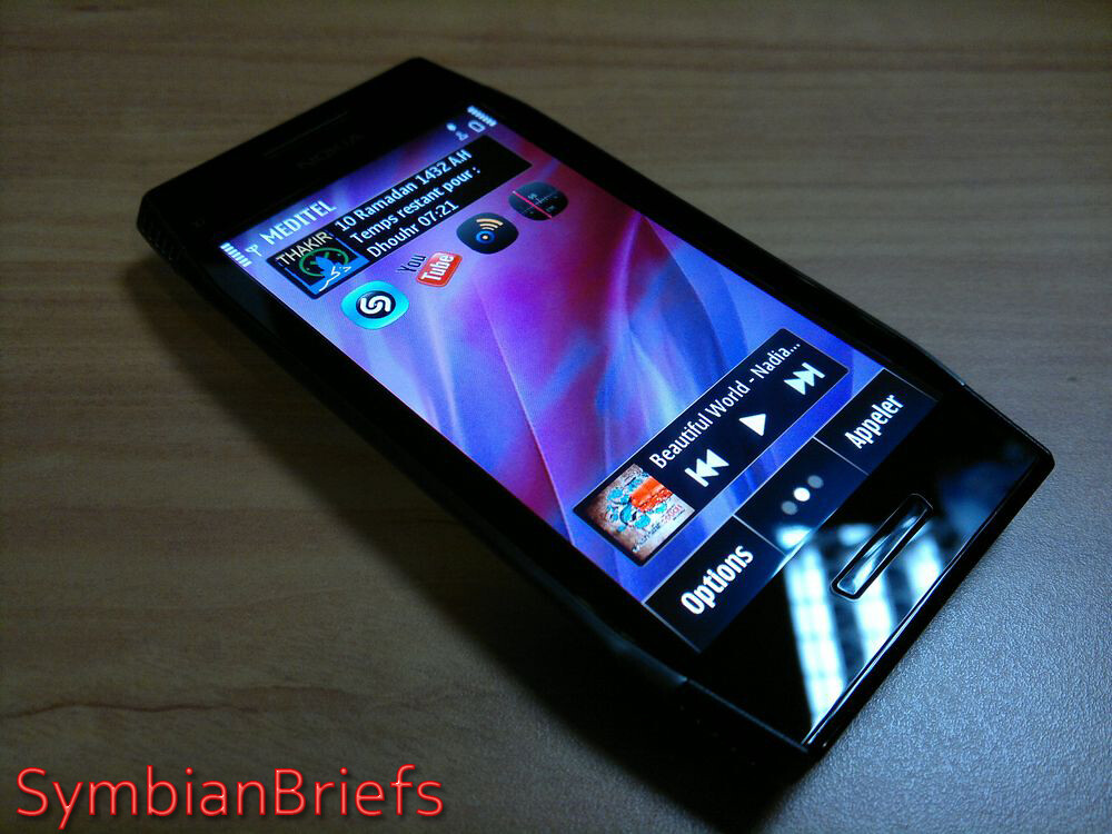
The next thing to come to my attention is that the entire front of the phone is covered by one piece of glass, giving it an extremely glossy look.
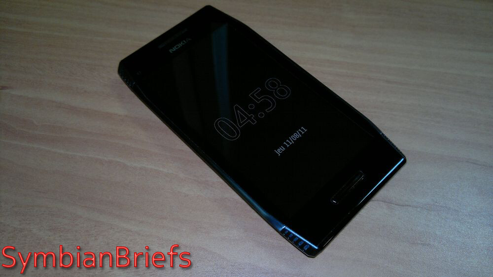 |
- Screen size: 4”
- Resolution: 16:9 nHD (640 x 360 pixels) AMOLED
- 16.7 million colours
- Capacitive touch screen
|
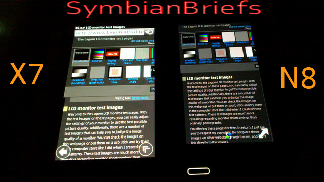
The AMOLED screen reproduces the images and multimedia content in general very well, with (not over) saturated colors, but the unit i have produce a pink tint like it's defective screen (like what we saw on some C7 and N8), so for me, the black isn't really black, and gray isn't really gray !
Sadly (for me) it's an AMOLED with anti-reflection layer (similar to the N8's display but mounted closer to the glass, increasing the apparent contrast), but not a CBD one nor as good as the CBD screen on the E7, but it's gorgeous indoors, still quite readable in sunlight, more readable than the one of the N8 anyway ;)
Plus nHD resolution of 640 x 360 on this device. It's justified by the need to keep consistency with the company's existing ecosystem, but it's a step behind the cutting edge and even to existing own Nokia portfolio (N8 or C7 vs X7) as bigger the screen is with the same resolution as we begin to see more pixels...
Physically, the X7 is a pleasure to hold and to handle, a hallmark of Nokia construction :
|
| The weight (with battery) is 146 g and it feels "heavy" and solid |
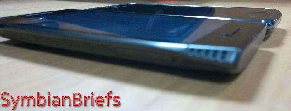
As you'll see on the next shot, there’s a small speaker grill at the top of the smartphone where you will also find the light and proximity sensor, i found this at the top of industrial design and it's more reliable from any similar solutions from other manufacturer or even Nokia itself on other products ! This is the first thing that let me say "WOW it's such an advanced design and
" !
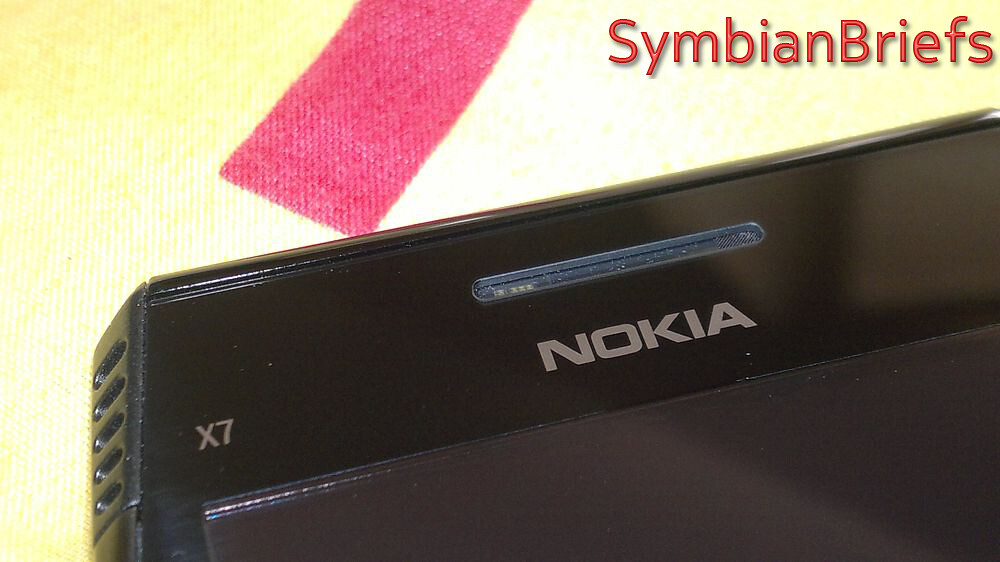 |
- Proximity sensor and the Ambient light detector on the left
- Speaker on the right
|
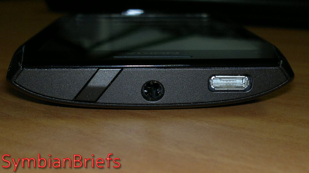 |
| on/off switch, a 3.5mm headset connector and microUSB port |
By the way, a small detail but it was one of the first thing i noticed too, the lock/power key is the best ever "power key" designed for a Nokia device (or any device around) ! Angled too, Big, Smooth, Easily accessible, Perfect !
On the left is the SIM slot, the cover of which i found impossible to remove !
And a microSD card slot which i was hardly able to get at !
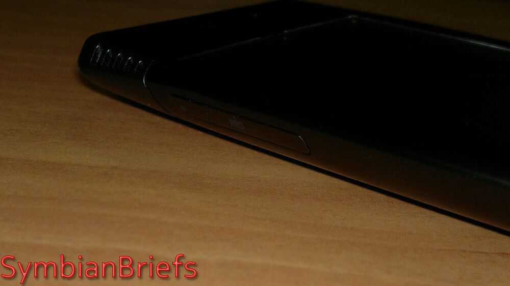 |
| The Nokia X7 comes with 8GB memory card pre-installed, with up to 350MB built-in operating memory. It can support MicroSD cards up to 32GB. |
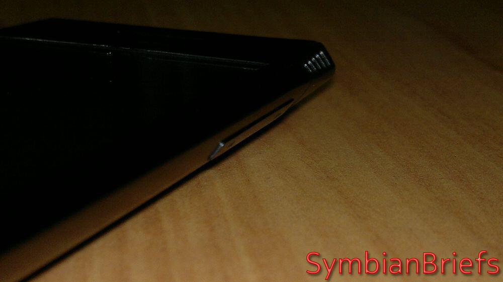
To open those slots, we're in front of unique opening mechanism – the lids actually serve as the front doors for the tiny drawers where you can put your cards. To open them, you first need to press one side of the lid and only then pull the whole drawer, I'd have much preferred a simple hinged cover with a standard slotting mechanism !
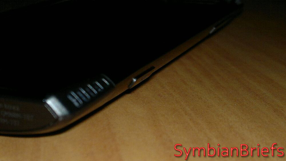 |
| Dedicated camera key |
 |
| Volume keys |
 |
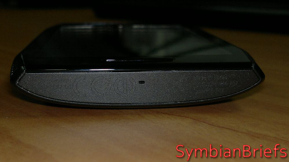
| Stereo speakers at the bottom, the other two holes at the top are just wannabe, don't be fooled it doesn't have 4 speakers ! |
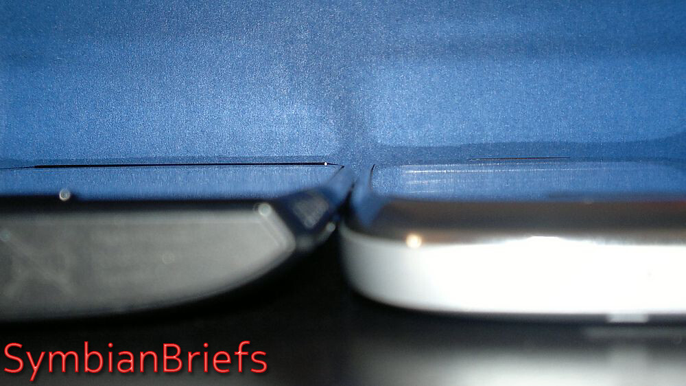
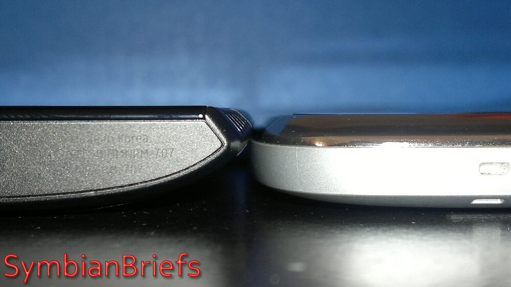
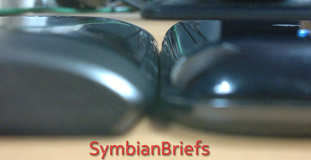
Those chamfered edges looking at it from the front, but viewing it from the top or bottom, you can clearly see the edges of the phone are significantly slimmer than the middle, allowing for a nice snug fit in the hand that feels solid.
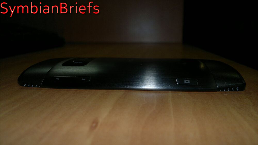 |
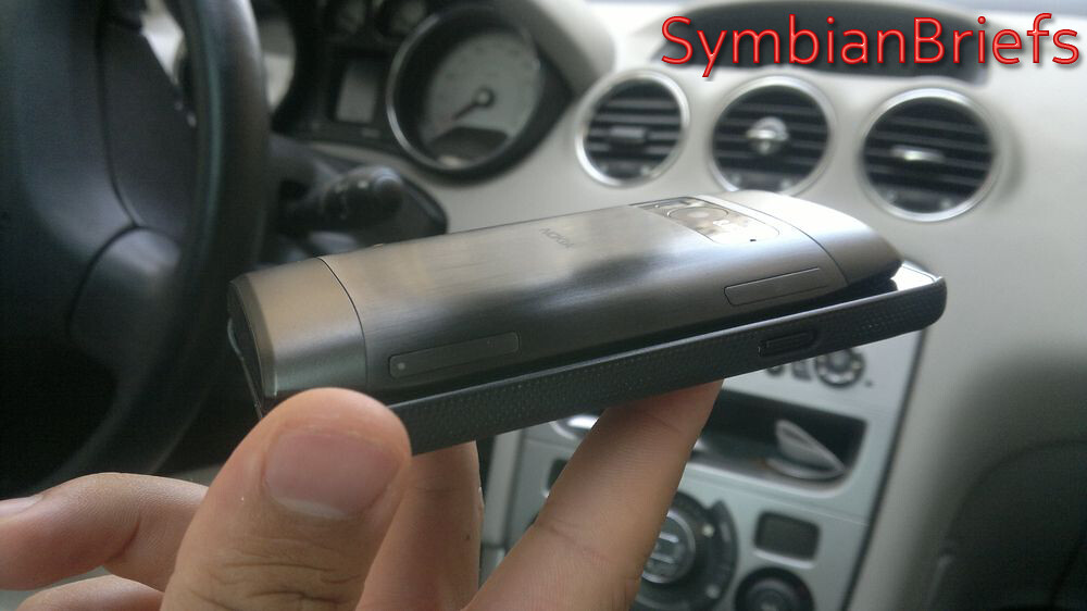
| The long edges are more curved and are made from metal that wraps round into the backplate |
From an everyday perspective, the side buttons are tricky to access because they're set on a curve that runs away from your fingers.
The volume rocker on the right is slightly more difficult than usual to rock; plus the camera button, also on the right, is difficult to use, but on the other hand, its oval profile contributes to a comfortable fit in the hand
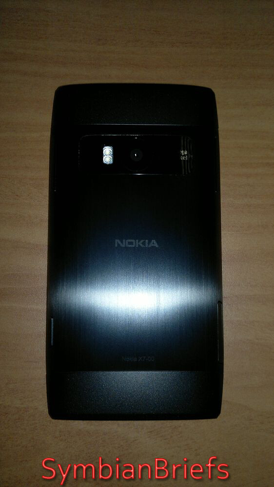 |
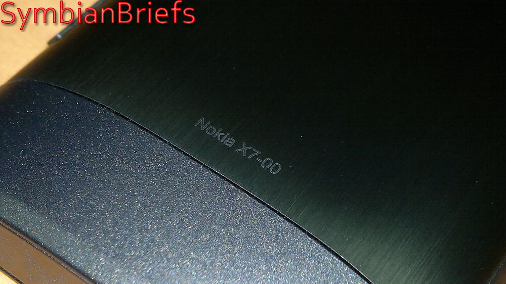
| The metal back cover seems very durable and adds to the premium feel of the handset, but unfortunately it's not removable. |
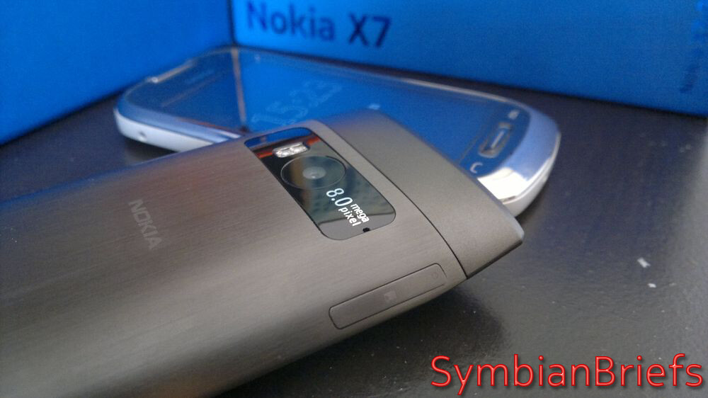 |
| Microphone hole next to the camera for a clear enough video soundtrack. But this doesn't provide in-call background noise reduction as other s^3 devices... |
One thing i like is the camera is somehow protected from scratching and damage and even if i touch often (less often then any device so far, thanks to the it's "bigger" design) the lens, there're no fingerprints which let me think that it was probably coated in that meaning.
 |
| 8 megapixel Full focus camera with 3rd generation dual LED flash |
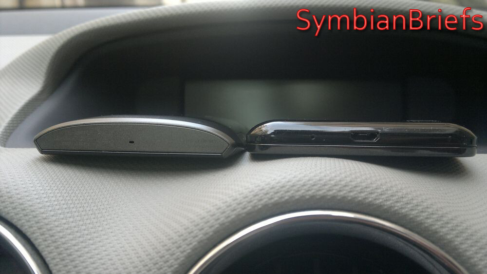
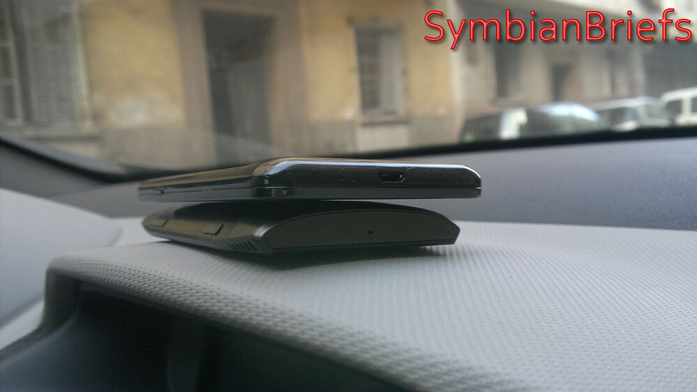
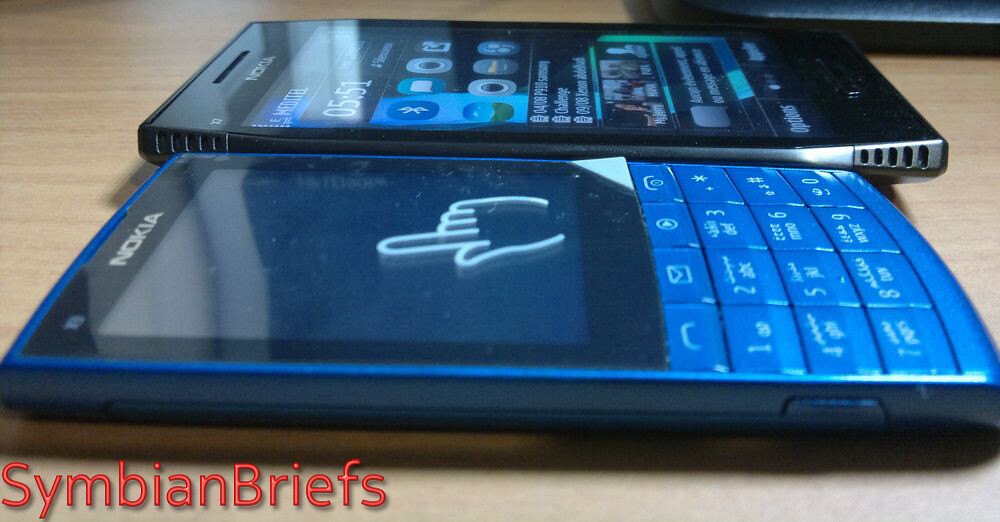
The X7 measures 119.7 x 62.8 x 11.9mm (thinner at the edges) as i noted earlier, its 11.9mm thickness feels and looks thinner thanks to the curved edges :
But how it compares to some of others devices?
X7 119.7 x 62.8 x 11.9 mm vs
C7 117.3 x 56.8 x 10.5 mm
X7 119.7 x 62.8 x 11.9 mm vs Samsung GS1 122.4 x 64.2 x 9.9 mm
X7 119.7 x 62.8 x 11.9 mm vs Samsung GS2 125.3 x 66.1 x 8.49mm
X7 119.7 x 62.8 x 11.9 mm vs X3 T&T 106.2 x 48.4 x 9.6 mm
But (a big one)
- How to explain to me that Samsung GS2 with its 8.49mm has a front facing camera, but the X7, which is almost 12mm in thickness, doesn't include a front camera? So Nokia has no excuse for that ?
- How to explain to me that a smartphone for extreme entertainment does not have HDMI connectivity?
- How to explain to me that a smartphone for extreme entertainment does not have a standard TV-Out with composite?
- How to explain to me that a smartphone for extreme entertainment does not have an FM transmitter?
- How to explain to me that a smartphone for extreme entertainment doesn't have a Compass (Magnetometer Sensor), no single AR (Augmented Reality) application worked for me !!
- How to explain to me that a smartphone for extreme entertainment doesn't have a 2.0mm Charger Connector?
- How to explain to me that a smartphone for extreme entertainment and its 120x63x12mm couldn't fit a bigger battery in it like the BP-4L?
- How to explain to me that a smartphone for extreme entertainment has no internal storage?
- How to explain to me that a smartphone for extreme entertainment has No CB (Clear Black) display and a business one (E7) has one?
- How to explain to me that a smartphone for extreme entertainment and the successor of the 5800 and X6 has inferior twin speakers quality? In fact, a little amount of the sound emerges through the grilles and most of it comes through the main body of the X7, it means no cymbals and drums boombastic feel as on the 5800 or teh X6 and no significant 'stereo' effect. The end result is inferior music output to the X6 or 5800, great ! Will talk about this deeply on dedicated part ;)
- Also, you should note that there’s no LED indicator for notifications, is Nokia following some irrelevant (again) current trend overall with manufacturers?
- There's no slide locker neither, replaced the power button (another iPhone inspired, sorry i mean copy/paste design element)
All in all, as a piece the Nokia X7 is a solid-feeling, interesting-looking smartphone with a metal backplate, Materials used are top-tier, build quality is in the high range, the 4" display means bringing the large screen to Symbian 'candybars' for the first time and the design is appealing to everyone who saw it so far and i was happy and proud to hear (again) : "Ah Nokia, they're still great in designing devices" from iPhone and Android users ;)
More to come in the next part :)
Comments and questions are welcomed !













No Response to "[X7 REVIEW] Part 1 : A Design From Another Planet !"
Post a Comment