I should note that this part of review applies also for the
E6 in 80% of most cases, i'll write a dedicated part anyway ;)
And yes !
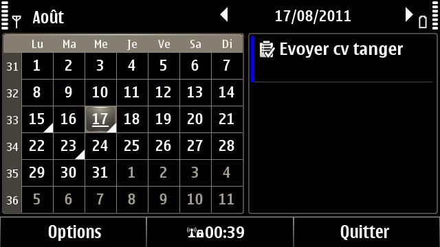
The big first difference with the Calendar functions with the Symbian Anna update is that we now get a split view approach to the layout. Previously the screen was dominated simply by numbered squares, now you'll find this has been condensed and a new empty pane added.
Click on a date on the calendar and where as before you simply got an empty page, now you'll find that a timeline has been added down the left-hand side so you can choose what time to add you appointment, helping speed up the whole process.
Dual-pane layout in the monthly view, the Calendar application in Anna becomes even more useful. You can tap on any day on the left panel, while on the right all of your appointments are shown. You can also use multitouch to zoom in/out switching between monthly and weekly views.
In Portrait mode you'll find the calendar at the top of the page and the Tap to Create Entry pane below it, while in Landscape mode they sit side-by-side. The main difference you'll find is that it takes one click out of adding an appointment or reminder. Previously you had to tap on the date and then tap again to enter information. Now you simply tap the Create tab and you're away.
You can still view in Month, Week or Day mode and there is still a To-Do list function. However, you'll also find that Agenda lists can be created within the Calender. This new look is far more intuitive and allows you to see at a glance what you have coming up that day, which is what you want and need most.
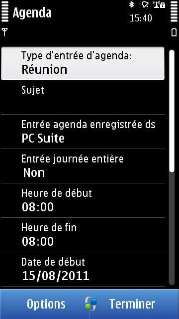
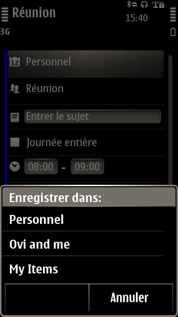
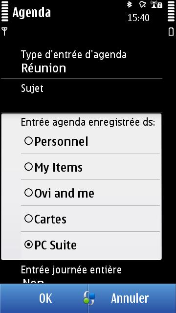
PS : The Anna screenshots on the left, pre-Anna (N8) on the right, and you can click on the screenshot to view it in the real size :)
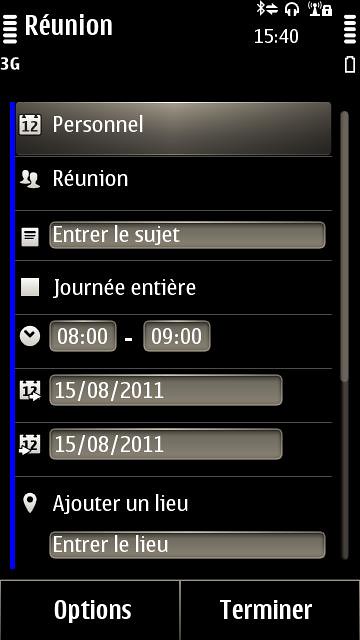
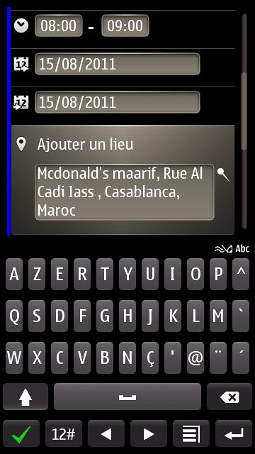
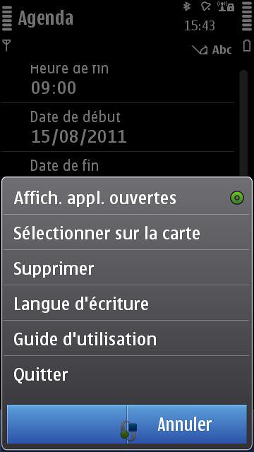
What is interesting is that now the "add a place" for a meeting is highlighted on the meeting process (before you have to select "options" and then "add a place") and clicking on the surrounded area bring the Maps application to choose the meeting place/address :)
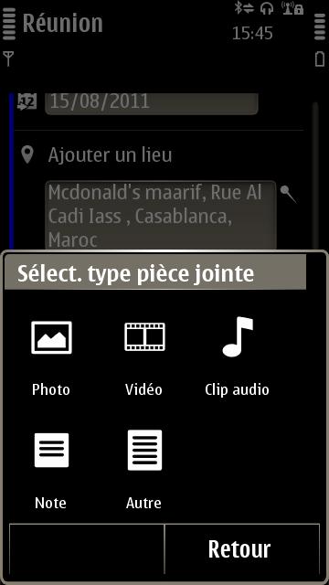
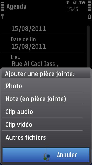
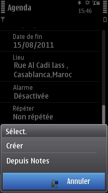
Another logical enhancement is when you want to join a note to an event, anna don't propose to create or to join a note as pre-anna did, which makes more sense...
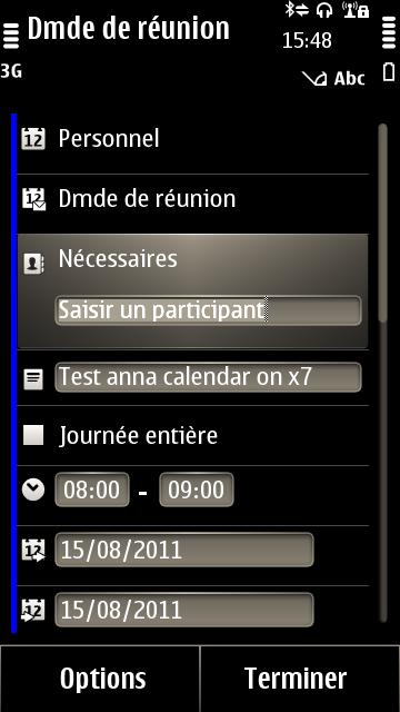
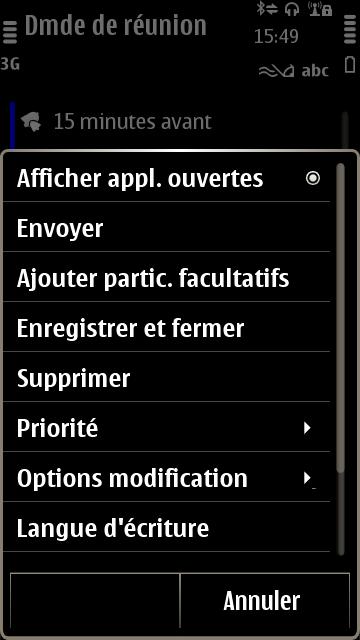
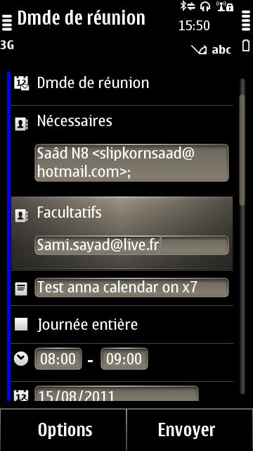
The good news is that we have now a contact -or actually a mailbox- integration, for reminding or inviting contacts/guests to upcoming meetings (meeting request) :
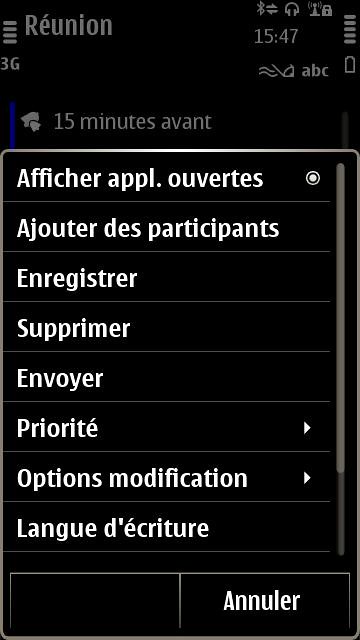
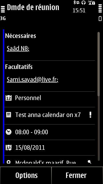
So that we have now the ability to add participants (from contact application but only for contacts with an email address filed in by tapping on the surrounded area) to a meeting and we can even add needful ones and "optional" ones !
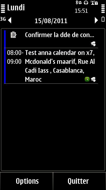
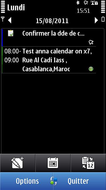
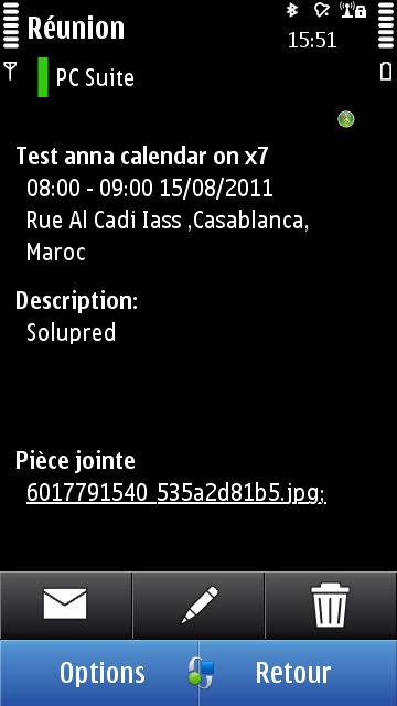
When the event is created it's presented as following on both versions :
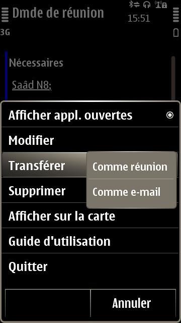
With anna we can send this event as a meeting (to participants we included in the event) or as an email with details of the meeting !
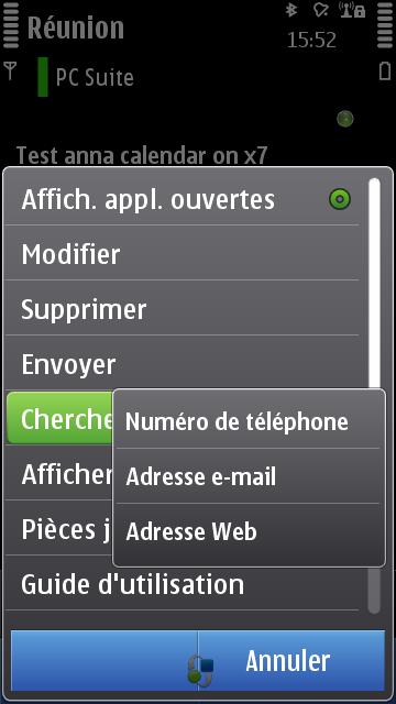
But with pre-anna, we got an extra option on the other hand to search a N°, Email or Web link in the event (not sure how is it useful and i guess that's why it was removed from Anna.
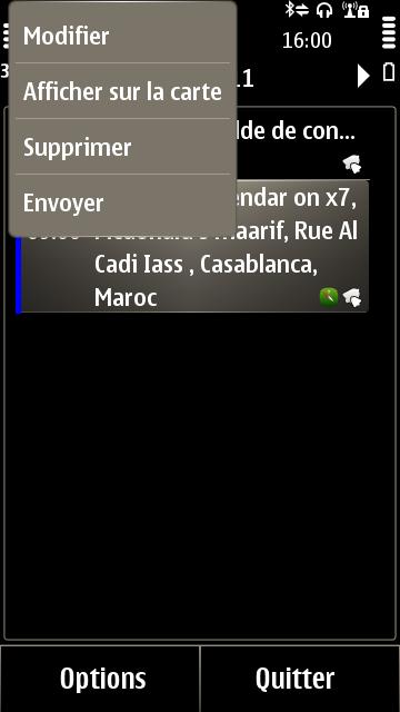
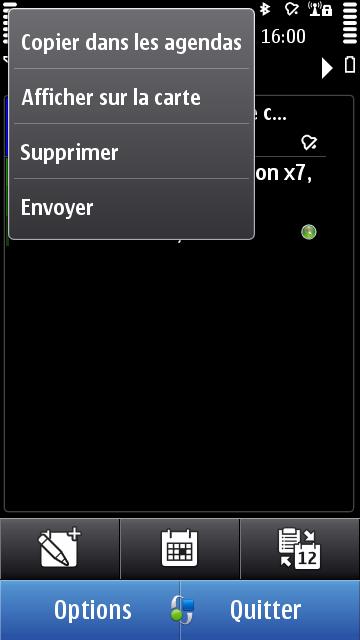
If we hold the tap on the meeting event both version offer the possibility to view the address of the meeting, delete it and send it but on pre-anna we have an option to copy the event into agendas while on Anna this option was replaced by edit the event :
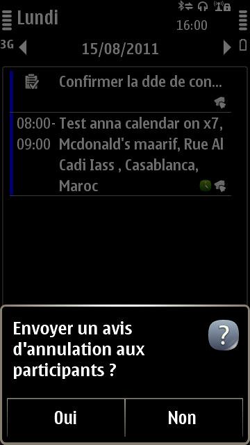
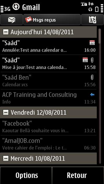
As i said earlier we can send the meeting to all participants included in the event, and what's the most interesting thing is that i the event was updated or canceled we have a popup asking if we should alert and inform the participants about that (by email with the subject "update" or "canceled") !!! Very nice touch !
In the introduction of the
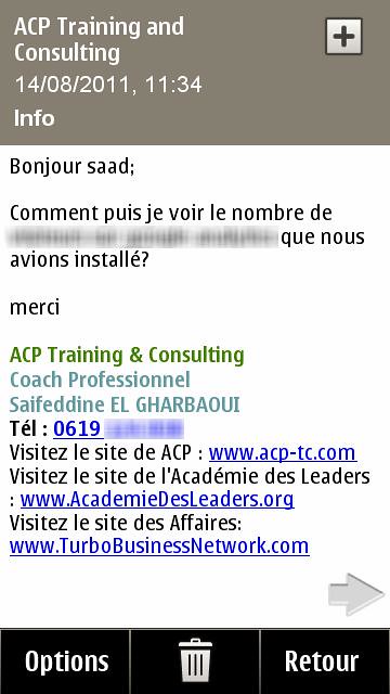
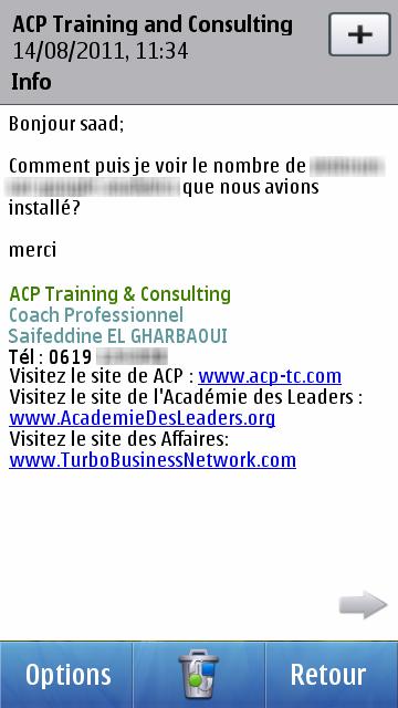
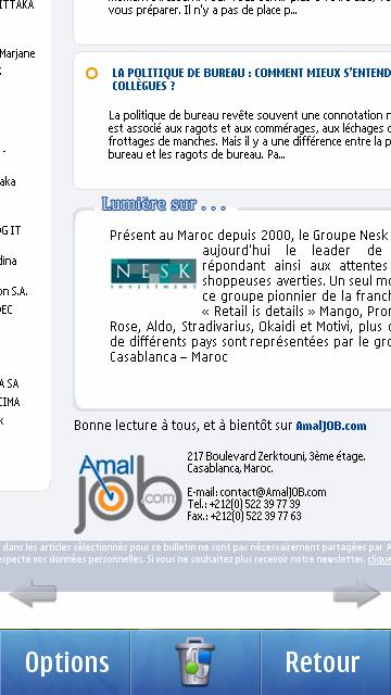
first part of this review, we said the Nokia X7 is more about being able to enjoy content that’s already out there, and speaking about email experience (integration) what i didn't like about my experience with the X7 is that the email core is zoomed in by 20% i guess (120%) and because of the nHD crappy resolution, every email is pixelated and it gives a very bad impression about the "quality of the screen" !
Plus we have to do a lot more of scrolling to view the same content of an email in comparison to the pre-anna (or even the anna E6)
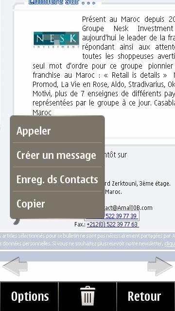
Another welcomed addition that i missed badly on my N900 and symbian devices, is that the email client can interact with phone numbers !
So when we select a phone number on a email, we have 4 options : Call it, Text it, Save in contacts and Copy it !
The aesthetic change is minimalistic (fonts are a little smaller, lists are longer etc) and i'm not fan of Anna black and white icons...
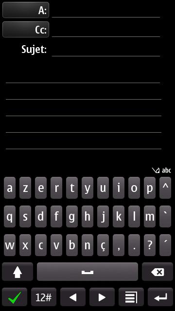
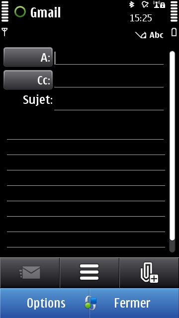
When we want to write a new email, the screen area is automatically expanded and the splited QWERTY keyboard (i'll talk about it in a dedicated part) is popping up, so we gain one more extra step on pre-anna way to do ;)
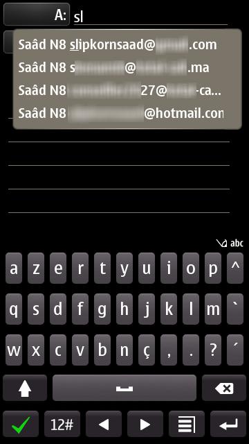
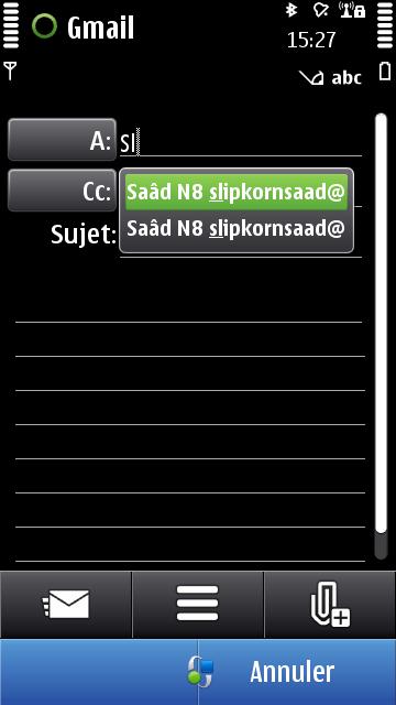
Live contacts is supported and make much more sense with the splitted keyboard, the area of live contact (and their email addresses) was extended to show more details about the actual email address, a welcomed enhancement as well !
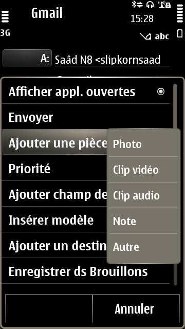
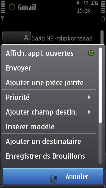
Some little cosmetic enhancements when we choose an attachment, we have a list of types of the attachment while on the pre-anna we have another menu with types of attachments to choose...
What i didn't like is that in calendar view (mostly accessible by calendar widget) we don't have that magic bar anymore, the bar that allowed us to create an event in a step or switch between views in one step as shown here :
What i miss also (partially from my N900) is the
birthday integration, when will you do that Nokia? Never i guess on symbian...
For email client :
- There's still no real push !
- Emails are not immediately deleted from the server on some cases
- There's still the 2Mb limitation for attachments and this is frustrating nowadays !
- I want some magic iOS touch here, if the email contains a PDF file, show me the PDF straight instead of an extra tape to save it or open it with dedicated application, if it contains a picture, or song or whatever, let the appropriate application integrates with the email client :)
- I want some Maemo 5 magic as well, allow me to send a rich html featured mail (bold, colors etc.)
So all in all, the few enhancements on calendar side make calendar application one of the advanced ones out of the box, sadly it insn't touch friendly yet but it's a work in progress, i hope it'll be the case on the final release of the
Belle update ! For email client, while it's rich in features it has still some limits despite faster than previous versions but i'm missing the reliability of the N900 client and some iOS magic touch ;)





No Response to "[X7 Review] Part 2 : [Anna] Calendar And E-Mail experience !"
Post a Comment